Why Matching Your Blinds to the Wall Always Looks a Shade Off
I’ve spent too many Tuesday nights with a steamer in one hand and a glass of wine in the other, wondering why my expensive new window treatments look 'wrong.' I had the paint chip. I had the fabric swatch. On my kitchen table, they were identical twins. But once they were up, the whole room felt shade off. It’s that mid-renovation panic where you realize your 'perfect match' is actually a visual headache.
We’ve all been there—trying to make a rental feel like home or finishing a big remodel. You want that seamless, high-end look, so you try to match the blinds to the paint. But unless you’re working with a custom dyer and a massive budget, you’re setting yourself up for a near-miss that feels like a mistake rather than a choice.
Quick Takeaways
- Light interacts with fabric and drywall differently; a perfect match is a myth.
- Aim for at least two shades of difference to make the contrast look intentional.
- Texture is your best friend when colors are slightly mismatched.
- Match the hardware to the window trim, not the wall color.
The Agony of the Near-Miss Paint Match
Bringing a paint swatch to the blind store is the most common trap in interior design. You find a linen-blend roller that looks exactly like 'Classic Gray,' you wait three weeks for delivery, and you drill into your headers with high hopes. Then, the sun hits. Suddenly, your walls look lavender and your blinds look muddy green. Stop Trying to Match Your Walls—It Always Looks a Shade Off because our eyes are incredibly sensitive to subtle shifts in undertone.
When two colors are 95% the same, the brain tries to reconcile them as the same color and fails. This creates a 'visual vibration' that makes the room feel uncomfortable. It’s better to be 20% different than 5% different every single time.
Why Your 'Matching' Whites Are Actually Clashing
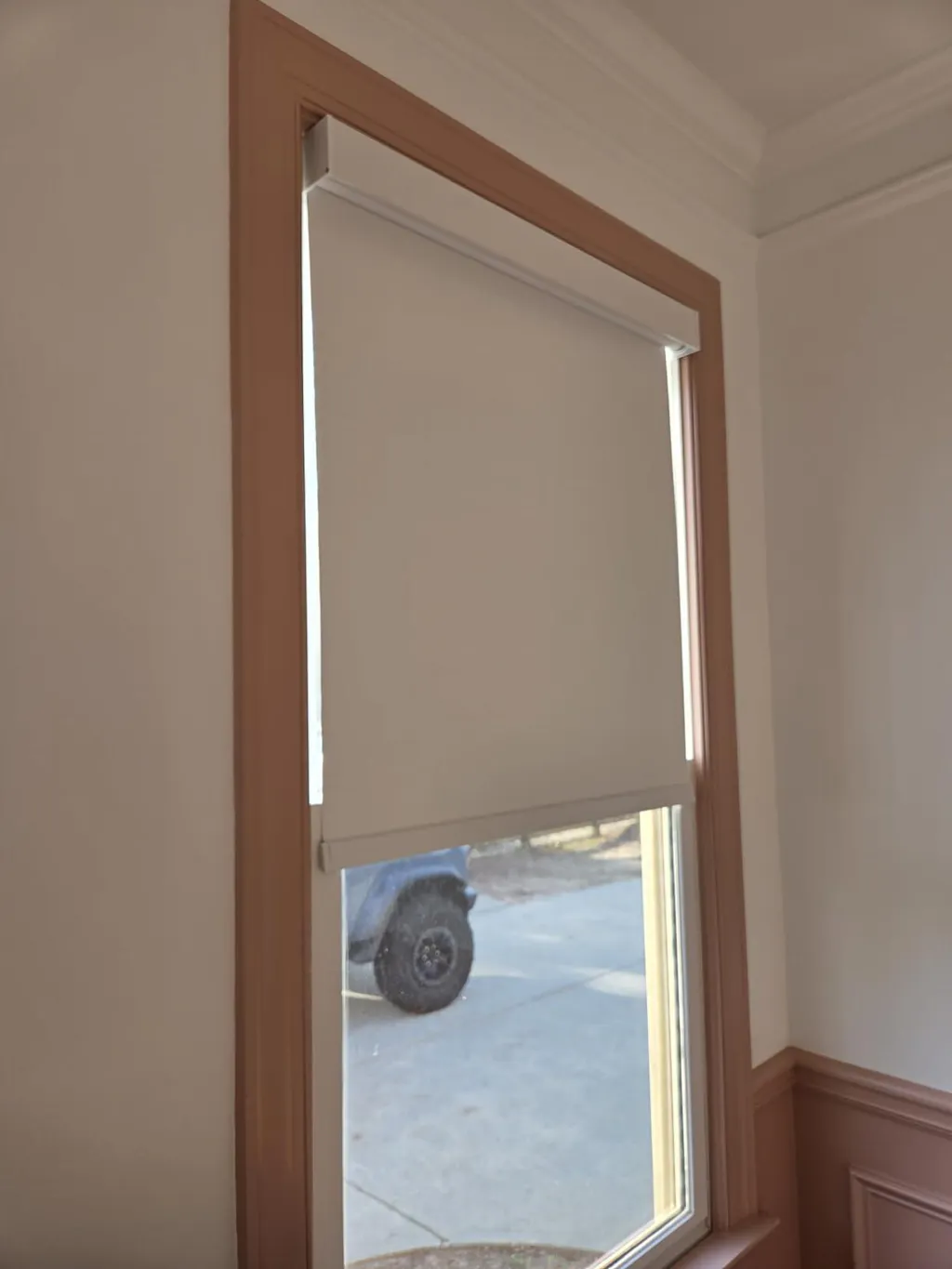
Whites are the hardest to get right. You might have a crisp, cool white on your walls (think 4000K light vibes), but your blinds have a yellow or pink undertone. When the afternoon sun filters through a 200 gsm fabric, it warms up the light. That 'off shade' clash happens because paint reflects light while fabric absorbs and transmits it.
I once saw a gorgeous primary suite ruined because the 'stark white' honeycomb shades turned a sickly cream next to the cool marble window sills. If you are stuck with whites that don't play nice, remember that the material itself changes the color. A flat-painted wall will never look like a woven textile, even if they share a name on a color card.
The Intentional Contrast Rule I Use Instead
If you can't hit a 100% match—and trust me, you won't—you need to lean into contrast. I tell my clients to stop looking for the same color and start looking for a partner. You want your window treatments to look like a deliberate design choice. If you’re struggling to find that balance, check out All Your Shade Solutions to see how different tones can actually complement your existing palette.
When to Go Exactly Two Tones Darker
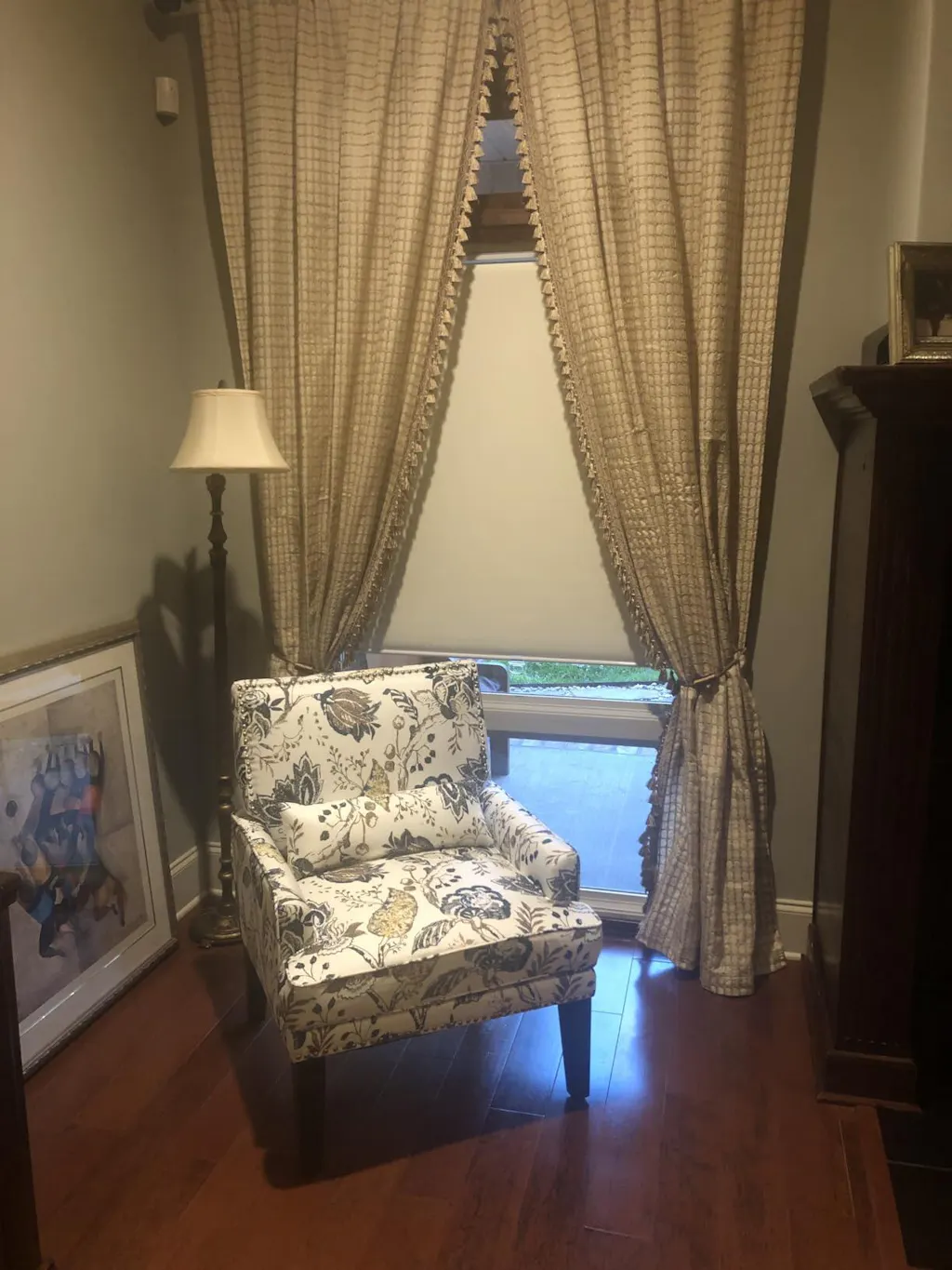
The safest move is to grab the paint strip for your wall color and move two or three boxes down. If your walls are a light greige, go for a mid-tone taupe or a deep charcoal for the windows. This grounds the window without breaking the monochromatic vibe. For bedrooms, I love using Day Night Shades in a darker, contrasting tone. It gives you that crisp daytime look but provides a moody, sophisticated vibe when the privacy layer is down at night.
Letting Texture Do the Work So Color Doesn't Have To
Texture is the ultimate 'get out of jail free' card for color discrepancies. A heavy, slubby linen or a woven wood shade has so much internal shadow and highlight that the eye stops looking for a color match. I often suggest a 2 In 1 Shade that uses a textured sheer. The variation in the weave hides the fact that the fabric might be a hair warmer than the paint. It looks like a natural material characteristic rather than a manufacturing error.
The Only Time I Ever Try to Match the Window Trim
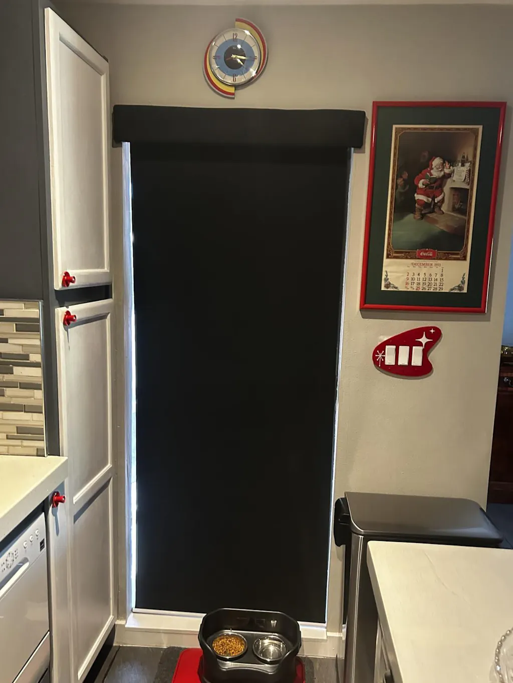
There is one exception: the hardware. If you have chunky white trim, I’ll often specify a blind cassette or a valance in that exact white. You want the 'engine' of the window treatment to disappear into the architecture. By matching the trim instead of the wall, the shade looks like it’s part of the window itself. Use a matte finish for the hardware; glossy finishes catch the light and highlight the very color differences you’re trying to hide.
Quick Fixes if Your Current Blinds Are Clashing
If you’ve already installed blinds that look like an 'off shade' nightmare, don’t rip them out yet. First, check your lightbulbs. If your blinds look too yellow, swap your 2700K bulbs for 3000K or 3500K 'bright white' LEDs. This can neutralize warm undertones instantly. Another trick is to frame the offending blinds with high-contrast drapery panels. A heavy velvet drape in a dark navy or forest green will draw the eye away from the wall-to-blind transition and make the whole setup look intentional.
My Own 'Off Shade' Disaster
A few years ago, I ordered custom Roman shades for my own guest room. I was convinced I could match the 'Pale Oak' walls. I spent $600 on what I thought was a perfect match. When I hung them, they looked like a dirty bandage. I hadn't accounted for the way my neighbor's red brick house reflected light into that specific room. I ended up having to add a black grosgrain ribbon border to the edges of the shades just to create a visual break between the fabric and the wall. It worked, but it was a two-day DIY project I hadn't planned for.
FAQ
How do I know if my blinds have the wrong undertone?
Hold the fabric against a sheet of pure white printer paper in the room where they will be hung. You’ll instantly see if the fabric leans blue, pink, or yellow. Then do the same with your wall paint.
Should blinds be lighter or darker than the walls?
Generally, darker. Darker shades feel more grounded and intentional. Lighter shades can sometimes look like they’re 'fading' into the wall in an unflattering way.
Can I mix different types of shades in one room?
Absolutely. As long as the hardware finish stays consistent (like all matte black or all brushed brass), you can mix a Roman shade on a small window with full-length drapes on a sliding door.