Stop Trying to Match Your Walls—It Always Looks a Shade Off
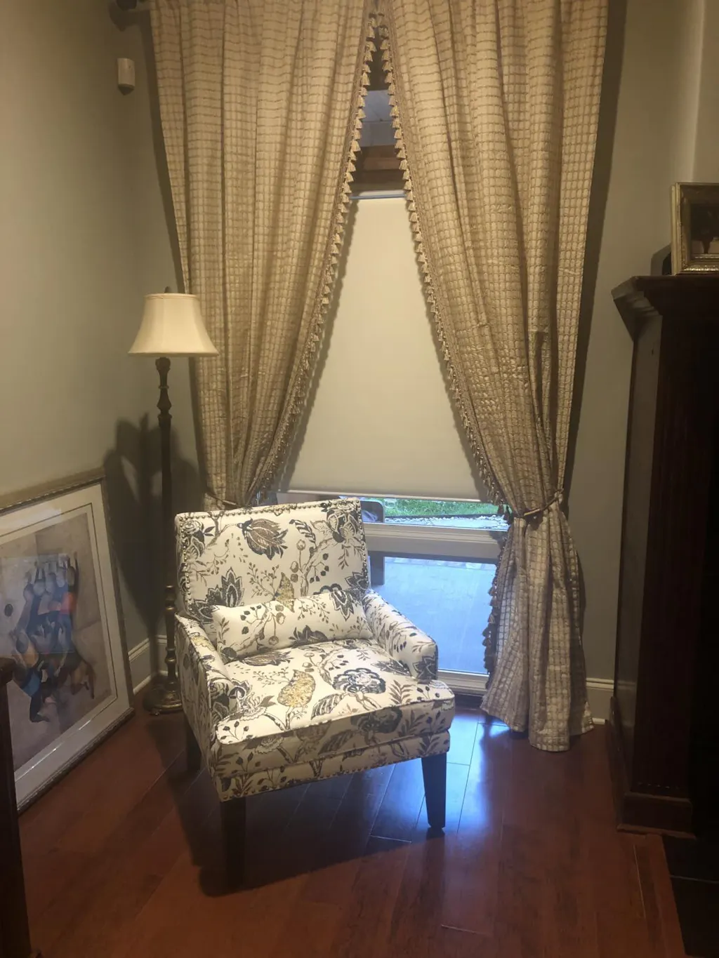
I remember the day I finished painting my bedroom in Benjamin Moore’s Simply White. I spent weeks hunting for the exact matching linen, thinking a seamless look would make the room feel like a high-end boutique hotel. I finally found a 220 gsm Belgian flax panel that looked identical in the store, but the second I hooked it onto the rings, my heart sank. It wasn't a match—it was just a shade off, making my brand new walls look like they’d been lived in by a heavy smoker for a decade.
- Paint is flat; fabric has dimension. They will never reflect light the same way.
- Metamerism is real—colors change based on the light source and time of day.
- Always aim for at least twenty percent difference in depth to avoid looking like an accident.
- Texture is the ultimate cheat code when color-matching fails.
The Inevitable Disappointment of the 'Perfect Match'
You spent $80 a gallon on matte paint. You spent hundreds on custom drapery. On paper, they are both 'Alabaster.' But your wall is a flat, solid surface that absorbs light, while your drapery has a weave, a nap, and a 2.5x fullness that creates deep shadows in every fold. This physical difference creates an off shade effect that is impossible to overcome with a dye lot. When two things are almost—but not quite—the same, the human eye perceives the one with more yellow or grey undertones as 'dirty' rather than 'intentional.'
I’ve seen clients go through three rounds of returns trying to find a white that doesn't clash with their trim. The reality is that the sheen of a polyester blend vs. the matte finish of a 100% cotton canvas will always fight each other. Even if you used the exact same pigment, the way the light bounces off a vertical fabric fold vs. a flat drywall surface means they will never truly match. It’s a battle you’re destined to lose unless you embrace a bit of distance between your colors.
Why Your Whites Look an Off Shade at 3 PM
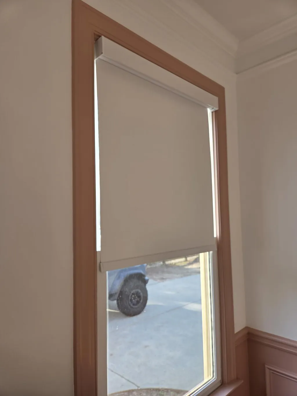
Natural light is a fickle designer. A north-facing room pulls in cool, blue light that can make a warm cream curtain look sickly. Conversely, south-facing windows are brutal during the golden hour. At 10 AM, your white linen might look crisp and clean next to your grey walls. By 3 PM, that warm golden light hits, and suddenly your cool-toned walls are fighting with your now-orange curtains. This shifting intensity is why I often suggest day night shades to manage the transition. You need layers that can adapt when the sun decides to change your entire color palette for you.
I once worked on a living room with massive floor-to-ceiling windows where the client insisted on matching the drapes to the 'Cool December' paint. By mid-afternoon, the bounce-back from the oak floors turned the fabric into a muddy peach while the walls stayed a stark, icy blue. It looked like a mistake because it was. If you don't account for the 'bounce' of light off your flooring and furniture, your window treatments will always feel like an off shade compared to the rest of the room. Using light-filtering layers allows you to neutralize some of that harsh afternoon glow before it hits your main fabric panels.
The 20-Percent Rule for Intentional Contrast
Stop aiming for 100% and start aiming for 80% or 120%. This is my golden rule for window treatments: go at least twenty percent lighter or darker than the wall color. If your walls are a mid-tone grey, don't look for a mid-tone grey fabric. Go for a deep charcoal velvet or a pale silver silk. This tells the eye, 'I meant to do this.' It creates a frame for your window rather than a blurry, unsuccessful attempt at camouflage.
When you browse all your shade solutions, look for swatches that clearly sit in a different category of depth than your paint chip. If you have a dark, moody navy wall, a crisp white or a very pale grey provides a sharp, sophisticated break. If you have light beige walls, try a rich camel or a deep espresso. This contrast provides visual relief and actually makes the room feel larger because it defines the boundaries of the space rather than letting them bleed together in an unsettling, mismatched way.
How to Fake a Match with Layered Textures
If you are a die-hard minimalist who absolutely needs that monochromatic, 'quiet luxury' look, texture is your only salvation. You can’t match the color, so you have to distract the eye with the weave. I love layering a very sheer, open-weave linen over a more structured, opaque backing. This is where a 2 in 1 shade becomes a literal lifesaver. By having a sheer layer that catches the light and a solid layer behind it, you create a visual buffer that softens the transition between the wall and the window.
The sheer fabric acts as a filter, blurring the line where the fabric ends and the wall begins. This prevents the eye from focusing on the slight color discrepancy. I usually recommend a 150 gsm sheer paired with a heavier 300 gsm blackout liner. The depth created by the two layers creates its own shadows and highlights, making the 'match' feel intentional and architectural rather than a failed DIY project. The layered approach also gives you better control over privacy without sacrificing that airy, light-filled aesthetic.
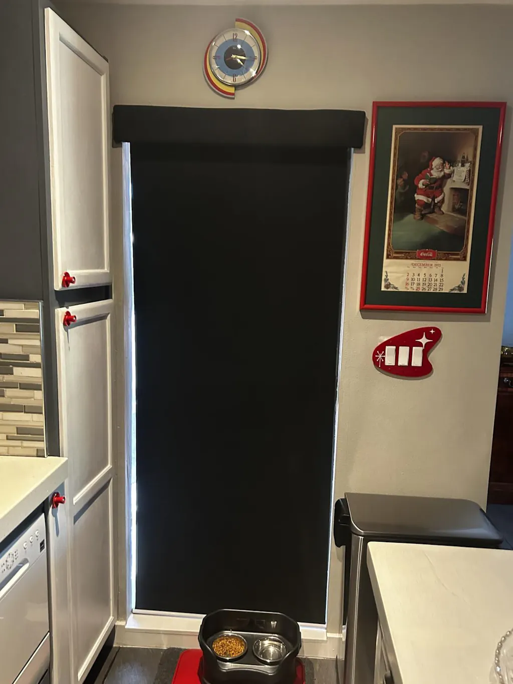
When to Just Rip the Shade Off and Start Over
Sometimes you have to admit defeat. I’ve been there—standing in a room at midnight, trying to convince myself that the pink-toned beige curtains look 'fine' against the yellow-toned cream walls. They don't. They won't. If the undertones are fundamentally clashing, no amount of steaming, high-end hardware, or clever lighting will fix it. Sometimes you just have to rip the shade off the wall and start over with a color that actually works.
If you find yourself in this position, take it as an opportunity to upgrade more than just the color. If you're replacing a clashing treatment, consider if this is one of the places you actually need an automatic window shade. If you're going through the trouble of re-measuring and re-drilling, you might as well add the convenience of motorization. It turns a frustrating design mistake into a functional home upgrade. Trust your gut: if it looks wrong the moment you hang it, it will look wrong every single day you live with it.
How do I know if my curtains are a warm or cool white?
Hold the fabric against a sheet of pure white printer paper. If the fabric looks yellow or orange, it’s warm. If it looks blue, grey, or slightly purple, it’s cool. Always match the temperature of your fabric to the temperature of your paint, even if the shades are different.
Should curtains be lighter or darker than the walls?
Generally, darker curtains feel more grounded and formal, while lighter curtains feel airier and more casual. Both work beautifully as long as there is enough contrast (the 20-percent rule) to show they aren't trying to be the same color.
What is the best fabric for a 'perfect' drape?
I always swear by a linen-polyester blend. Pure linen wrinkles if you even look at it funny, but a blend (around 10% poly) keeps the heavy, expensive-looking drape and 'slub' texture of linen while resisting the accordion-style wrinkles that ruin the look of a clean window.