Stop Buying Pure White Blinds. Off-White Window Shades Look Better
I remember staring at my first 'finished' living room and wondering why it felt like a high-end dental office. I had the mid-century sofa, the jute rug, and what I thought were crisp, clean white blinds. It wasn't until a Tuesday morning when the sun hit the slats that I realized the problem: they were too white. They were so bright they were practically vibrating against my cream-colored walls. Switching to off-white window shades was the moment the room actually started to feel like a home rather than a staged set.
Quick Takeaways
- Pure white reflects blue light, making rooms feel cold and clinical.
- Off-white shades absorb light, softening the transition between glass and drywall.
- Texture is non-negotiable—avoid flat, shiny vinyl at all costs.
- Matching undertones to your trim prevents shades from looking 'dirty.'
The Issue With Pure White Blinds (They Look Like Primer)
There is a reason professional painters use primer before the actual color goes on. It is flat, stark, and devoid of soul. When you hang pure white blinds, you are essentially covering your windows in primer. In the world of optics, a stark white fabric or slat reflects the blue light from the sky outside. This creates a cool, slightly blueish cast that can make even the most expensive furniture look cheap and washed out.
I have walked into so many homes where the owners complained about a 'sterile' vibe despite having warm wood floors. The culprit is almost always the window treatments. Pure white doesn't just look bright; it looks unfinished. It lacks the pigment necessary to interact with the shadows in your room, meaning you lose the depth that makes a space feel cozy at night.
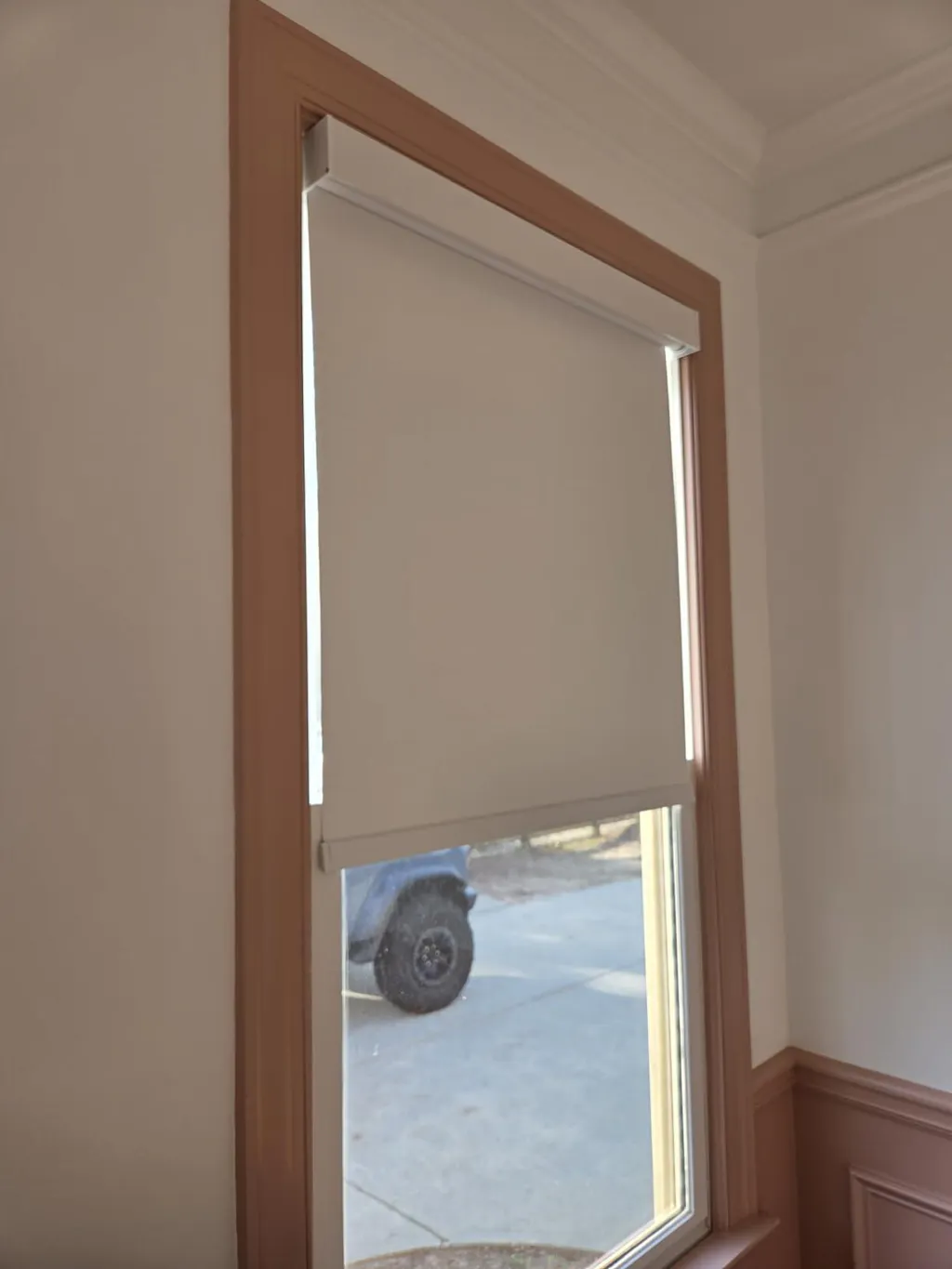
What Makes Off-White Window Shades Look So Expensive?
Off-white isn't just one color; it is a spectrum of alabaster, oyster, cream, and parchment. These shades have a tiny bit of yellow, brown, or gray in them that catches the light instead of bouncing it right back at you. This creates a soft, diffused glow that mimics the way light filters through a high-end hotel lobby. It softens the hard architectural angles of your window frame, making the transition from the outdoors to your interior feel intentional.
The luxurious look of off-white fabric is only amplified by upgrading to automatic options with sleek, cord-free mechanics. When those creamy layers move silently at the touch of a button, the room feels sophisticated. It’s about that gentle visual transition—the shade becomes part of the wall’s architecture rather than a plastic distraction tacked onto it.
How to Pick an Off-White That Doesn't Look Dingy
The number one fear my clients have is that an off-white shade will look 'dirty' next to their white trim. Here is the secret: it’s all about the undertone. If your trim is a crisp, cool white (like Benjamin Moore Chantilly Lace), look for an off-white shade with a slight gray or 'oyster' undertone. It will look sophisticated and deliberate.
If your walls are a warmer white or a true cream, go for an ivory or alabaster shade. The goal isn't to perfectly match the wall—it's to sit in the same family. I usually recommend holding a sample up against your trim at 10 AM and 4 PM. If the shade looks yellow-green in the afternoon light, keep looking. You want something that stays neutral even as the sun moves.
The Textures That Make or Break a Neutral Shade
Color is only half the battle. If you choose an off-white in a flat, shiny vinyl, it’s still going to look like a rental upgrade. To make off-white look truly bespoke, you need texture. I’m talking about subtle slubs in the fabric, linen weaves that show the occasional imperfection, and matte finishes that drink in the light.
Selecting high-quality woven roller shades in an off-white tone brings a tailored texture to the window frame that flat materials just can't touch. A 300 gsm linen blend has enough weight to hang straight but enough 'soul' in the weave to create micro-shadows. These shadows are what give the shade depth, preventing that flat, plastic look that plagues cheaper alternatives.
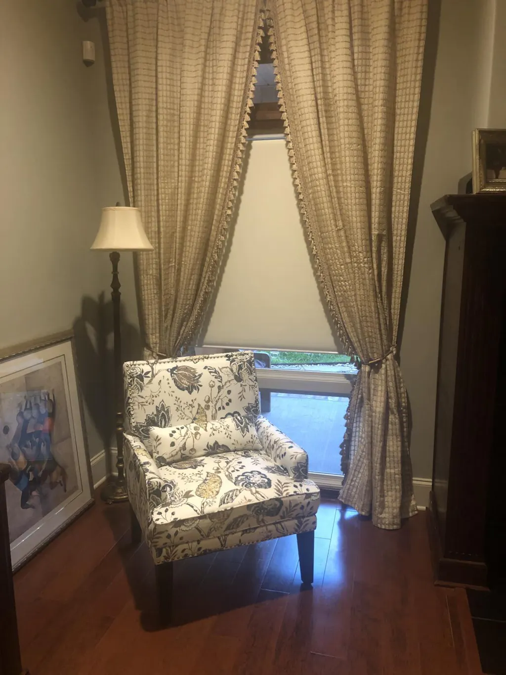
Layering Off-White Shades for the Perfect Puddle
One of my favorite styling tricks is layering an off-white shade behind a heavier set of drapes. This creates a romantic, diffused glow that makes any room feel like a sanctuary. When you have a textured off-white shade as your base, you can layer a heavier 96-inch velvet or linen panel over it for a look that feels layered and expensive.
Using dual-fabric day night shades allows you to play with different off-white opacities depending on the time of day. You can have a sheer, light-filtering off-white layer for the morning sun and a more opaque, creamy privacy layer for the evening. This layering of similar tones—rather than high-contrast whites—is what gives a room that 'designer' feel without being loud.
Wait, Are There Any Rooms Where Pure White Actually Works?
I’m not a total hater; there is a place for pure white. If you are living in an ultra-contemporary gallery space with polished concrete floors, black steel windows, and stark white walls, a pure white shade can work. In those cases, the 'clinical' look is the aesthetic. But for 95% of homes—homes with wood, rugs, and life—off-white is the superior choice every single time.
The Mistake I Made So You Don't Have To
Early in my career, I ordered custom 'Snow White' linen shades for a client's sunroom. I thought it would look fresh. When they arrived, they looked like I had hung hospital sheets over the windows. The fabric was beautiful, but the color was so devoid of warmth that it made the client's expensive oak floors look orange by comparison. I ended up eating the cost and reordering them in a soft 'Parchment' tone. The difference was night and day—the room suddenly felt expensive and grounded. Measure twice, but check your swatches three times.
FAQ
Will off-white shades make my white walls look yellow?
Not if you choose the right undertone. If your walls are a cool white, choose an off-white with gray undertones. If your walls are warm, go with a cream or ivory. Avoiding the 'yellow' look is all about staying in the same color temperature as your paint.
Can I mix off-white shades with pure white trim?
Yes, and it actually looks great. The slight contrast creates a 'layered' look that feels more intentional than trying to match two different whites perfectly, which almost never works.
Are off-white shades harder to keep clean?
Actually, they are more forgiving than pure white. Pure white shows every speck of dust and every fingerprint. Off-white, especially with a bit of texture, hides the realities of a lived-in home much better.