How I Keep Black and White Window Blinds From Looking Like a Barcode
I remember the first time I installed a high-contrast zebra shade in a client's breakfast nook. I thought I was being 'graphic' and 'bold.' Instead, every time the sun hit those slats, the whole room felt like it was vibrating. It was a headache in fabric form. black and white window blinds are the ultimate design gamble—they either look like a high-end boutique or a retail warehouse barcode.
The trick isn't to avoid the contrast, but to control the rhythm. When you have stark horizontal lines competing with the vertical lines of your window casing, your brain struggles to find a place to rest. I've spent years figuring out how to use these black and white window shades without making my guests feel like they’re staring at an optical illusion.
Quick Design Rules
- Always prioritize an 80/20 color split over an even 50/50.
- Frame graphic blinds with soft, solid-colored drapes to anchor the room.
- Match your hardware to the darkest tone in the blind.
- Choose flat fabrics for large windows to avoid 'pattern fatigue.'
The 'Barcode Effect' (And Why Graphic Windows Usually Fail)
The 'barcode effect' happens when the scale of your window treatment matches the scale of your furniture too closely. If you have a striped blind and a striped rug, you’ve basically created a strobe light. It’s a common pitfall: people pick a pattern they love in a 4-inch swatch, but once it’s stretched across a 72-inch wide window, the repetition becomes aggressive. You need to Stop Making Your Black And White Window Blinds Look Like A Barcode by breaking up the visual frequency.
Intent matters here. If you want a graphic look, the window should be the 'punctuation mark' of the room, not the entire sentence. When the slats are too thin and the contrast is too high, the horizontal lines fight against the architecture of the house. I always tell my clients: if the blinds make you squint when the sun is out, the pattern is too busy for the scale of the room.
Rule #1: Pick a Dominant Color Instead of a 50/50 Split
Visual weight is everything. An even split between black and white creates 'visual noise' because the eye can't decide which color is the background and which is the accent. I prefer a white-dominant shade with thin black pinstripes or a deep charcoal base with a white border. It feels intentional rather than accidental. If you go too heavy on the white, it can look clinical; too much black, and it feels like a cave.
Interestingly, leaning into the darker side can be more functional. There is a The Counterintuitive Reason Black Mesh Window Shades Look Better Than White: black actually absorbs light rather than reflecting it back at you, which preserves your view of the garden or street. A black-dominant shade acts like a sunglasses lens for your room, whereas a bright white shade can create a blinding glare at 2 PM.
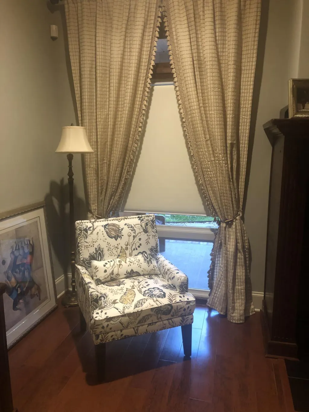
Why I Never Hang High-Contrast Blinds Without Heavy Drapes
Graphic blinds are 'hard' elements. They have sharp edges, mechanical movements, and geometric patterns. To make them liveable, you have to soften them with 'soft' elements. I never install a high-contrast blind without a pair of flanking drapes. I usually go for a 200 gsm linen blend in a soft off-white or a deep slate gray. You want at least 2.5x fullness so the fabric actually folds and creates shadows.
I like to hang the rod 4 inches above the trim and 8 inches past the frame on each side. This 'frames' the graphic blind, containing the energy of the black and white pattern. By letting the drapes puddle slightly—maybe a half-inch on the floor—you ground the window. It stops the blinds from looking like they’re just floating in the middle of a drywall desert. It’s about creating a sandwich of textures: hard, soft, hard.
Flat vs. Banded: Picking the Right Mechanism
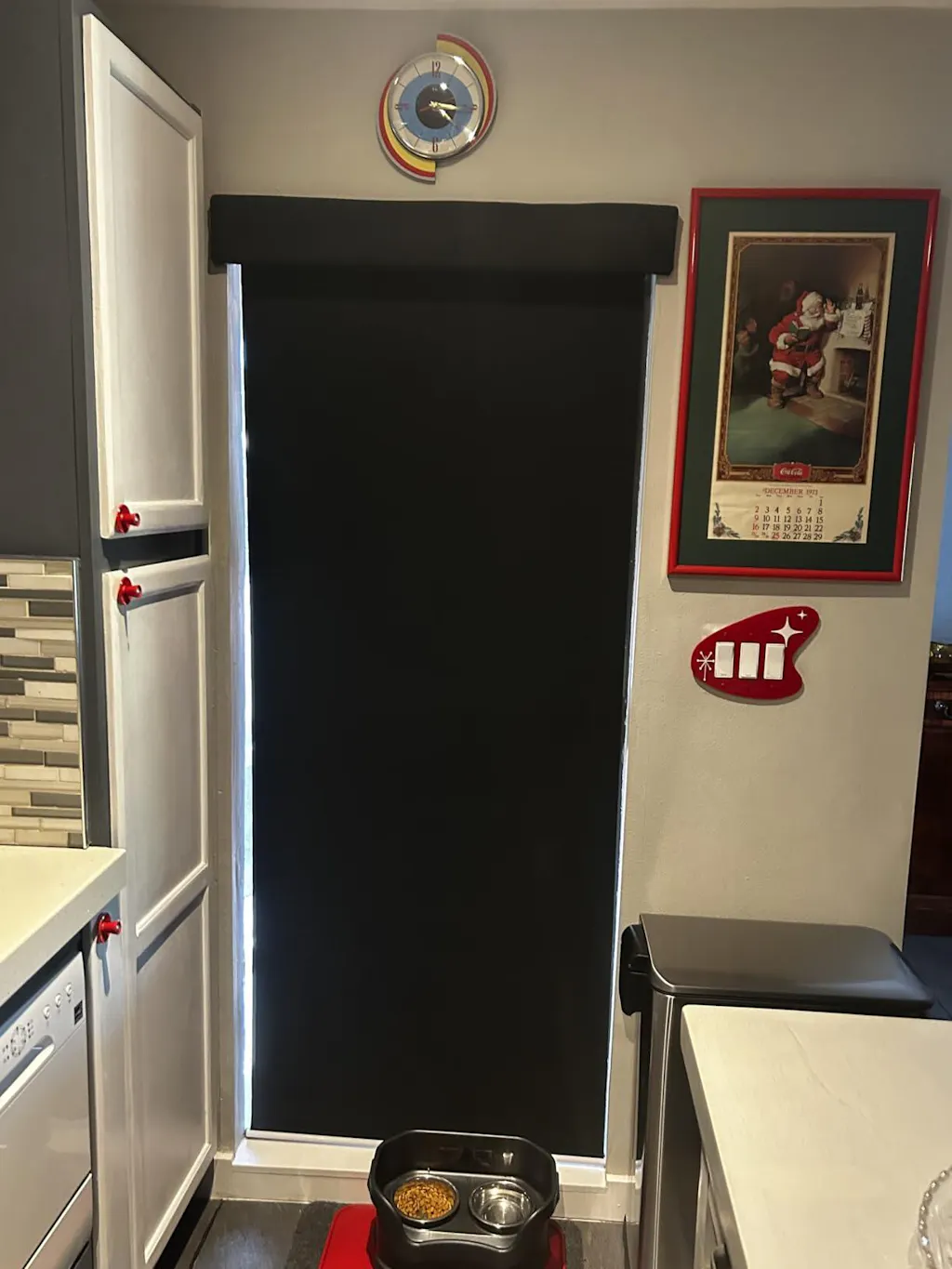
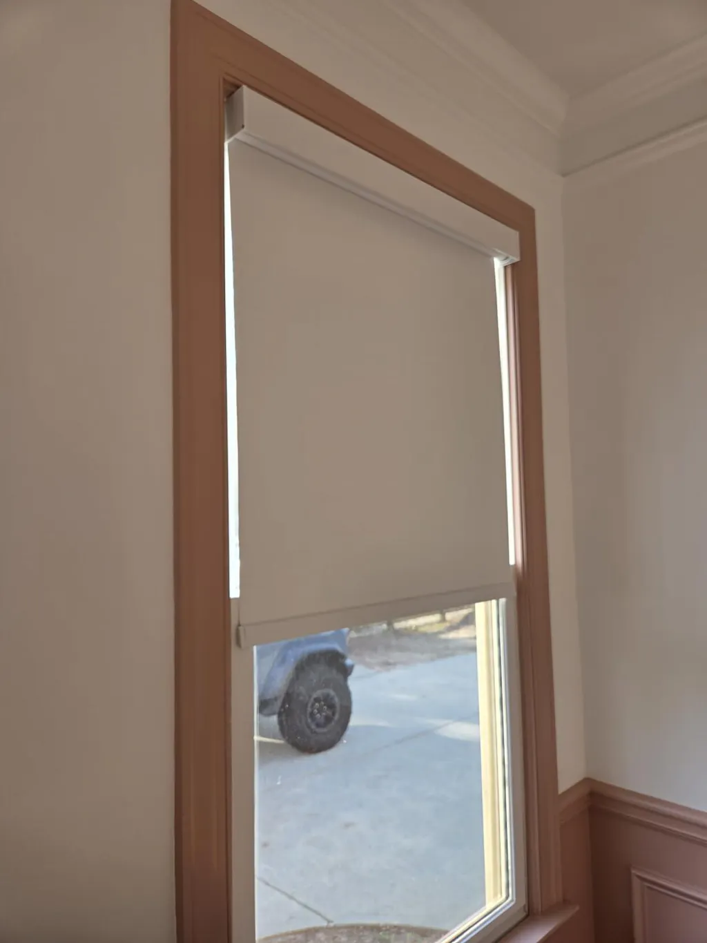
The mechanism you choose dictates how the pattern behaves. If you want a clean, wallpaper-like look, Roller Shades are the way to go. They provide a continuous canvas for the pattern. When they’re down, they look like a piece of art; when they’re up, they disappear into a discreet header. This is the safest bet for high-contrast designs because the pattern isn't interrupted by slats or folds.
On the other hand, if you need light control, Day Night Shades offer a more dynamic look. These use alternating bands of sheer and solid fabric. They are the 'zebra' look everyone recognizes. They work beautifully in modern spaces, but you have to be careful with the alignment. If the bands are slightly crooked, the high contrast will scream it from across the room. I always double-check my brackets with a laser level before the final snap-in.
The 3 Rooms Where Stark Graphic Windows Actually Shine
Not every room can handle the drama of a black and white window. In a kitchen with flat-panel cabinets and quartz counters, a graphic blind acts as a backsplash for your windows. It breaks up the monotony of all that cabinetry. I also love them in a moody powder room. Since you're only in there for a few minutes, you can afford to be a bit more 'extra' with the design.
The third spot is the home office. A crisp, geometric window treatment feels professional and alert. It’s the interior design equivalent of a well-tailored suit. Just make sure your desk isn't facing the window directly, or the 'barcode' might start to mess with your focus during those long afternoon Zoom calls. In these spaces, the architecture is usually simple enough to let the windows do the talking.
My Biggest Mistake
I once ordered a custom set of 96-inch black and white roman shades for a client's sunroom. I forgot to account for the 'stack'—the way the fabric bunches at the top when the shade is open. Because the fabric was a heavy canvas, the black and white stripes didn't line up when folded. It looked like a pile of laundry hanging at the top of the window. I had to have the workroom re-sew the headers to ensure the stripes matched perfectly when raised. Now, I always ask for a 'pattern match' on the stack. It cost me an extra $200, but it saved my reputation.
Frequently Asked Questions
Are black and white blinds too modern for a traditional home?
Not if you choose the right pattern. A toile or a subtle pinstripe in black and white can feel very classic. It's the wide, horizontal 'zebra' bands that lean modern. Stick to organic patterns if your home is more traditional.
Do these shades show dust easily?
The black bands definitely show dust more than the white ones. I keep a microfiber duster handy and give them a quick swipe once a week. Avoid using wet wipes, as they can streak the black fabric and leave a residue.
Will black and white shades make my room look smaller?
If the pattern is large and the black is dominant, it can pull the walls in. If you're worried about space, go for a white-dominant shade with very thin black accents to keep things feeling airy and open.