Stop Making Your Black and White Window Blinds Look Like a Barcode
I still remember the first time I tried to pull off a high-contrast window scheme in a narrow Brooklyn brownstone. I had ordered these sharp, alternating black and white window blinds, thinking they would give the room a crisp, editorial edge. Instead, the moment I rolled them down, the living room felt like a giant, vibrating optical illusion. Every time I walked past the window, the alternating slats made my eyes twitch. It was not chic—it was a barcode.
We have all been there, seduced by the clean lines of a monochrome palette only to realize that high contrast is a high-wire act. If you do not get the scale and the layering right, your black and white window shades can end up looking like a retail storefront rather than a curated home. Here is how to handle the most difficult color duo in the design playbook.
- Choose black mesh for view preservation and white fabric for diffused privacy.
- Layer stark black rollers under soft, off-white linen drapes to kill the 'office' vibe.
- Match your hardware to the darker shade to ground the window frame.
- Avoid thin, alternating stripes; go for solid blocks of color or dual-shade systems.
The 'Barcode Effect' (And Why It Ruins Good Architecture)
The 'barcode effect' happens when you have narrow, high-contrast horizontal lines—like black slats on a white frame—that are too close together. From a distance, your brain struggles to process the rapid-fire shift between light and dark. This creates a visual vibration that is physically tiring to look at. In a room where you are trying to relax, the last thing you want is a window treatment that demands that much cognitive labor.
Beyond the headache, these harsh horizontal lines trick the eye into thinking the ceiling is lower than it actually is. It chops the wall into dozens of tiny segments. If you are working with a standard 8-foot ceiling, a barcode-style blind acts like a visual 'stop' sign, preventing the eye from traveling upward. The result? A room that feels chaotic and compressed. I have seen perfectly good mid-century architecture ruined by blinds that look like they belong in a 1990s cubicle farm.
When You Actually Should Use Black and White Window Shades
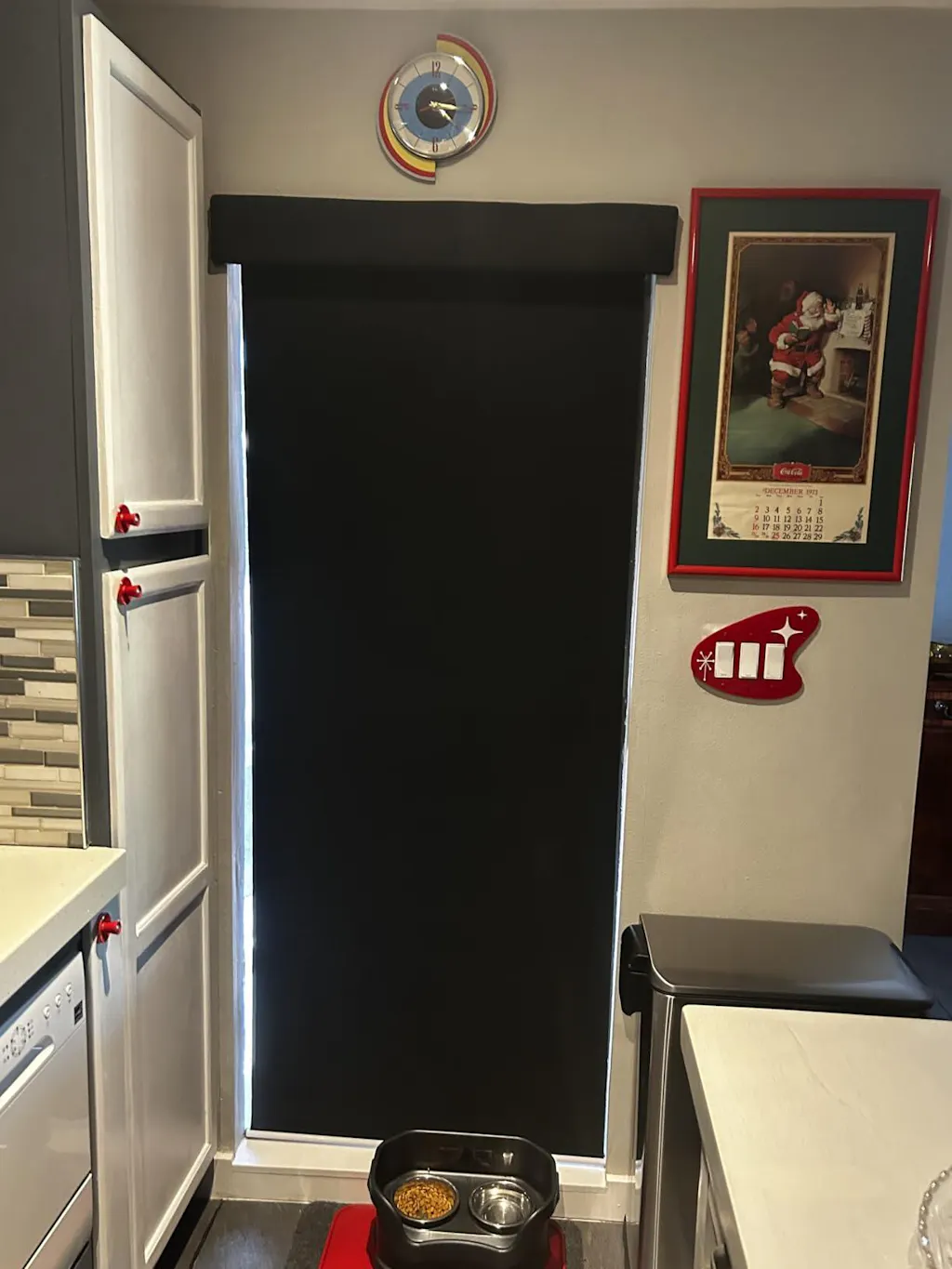
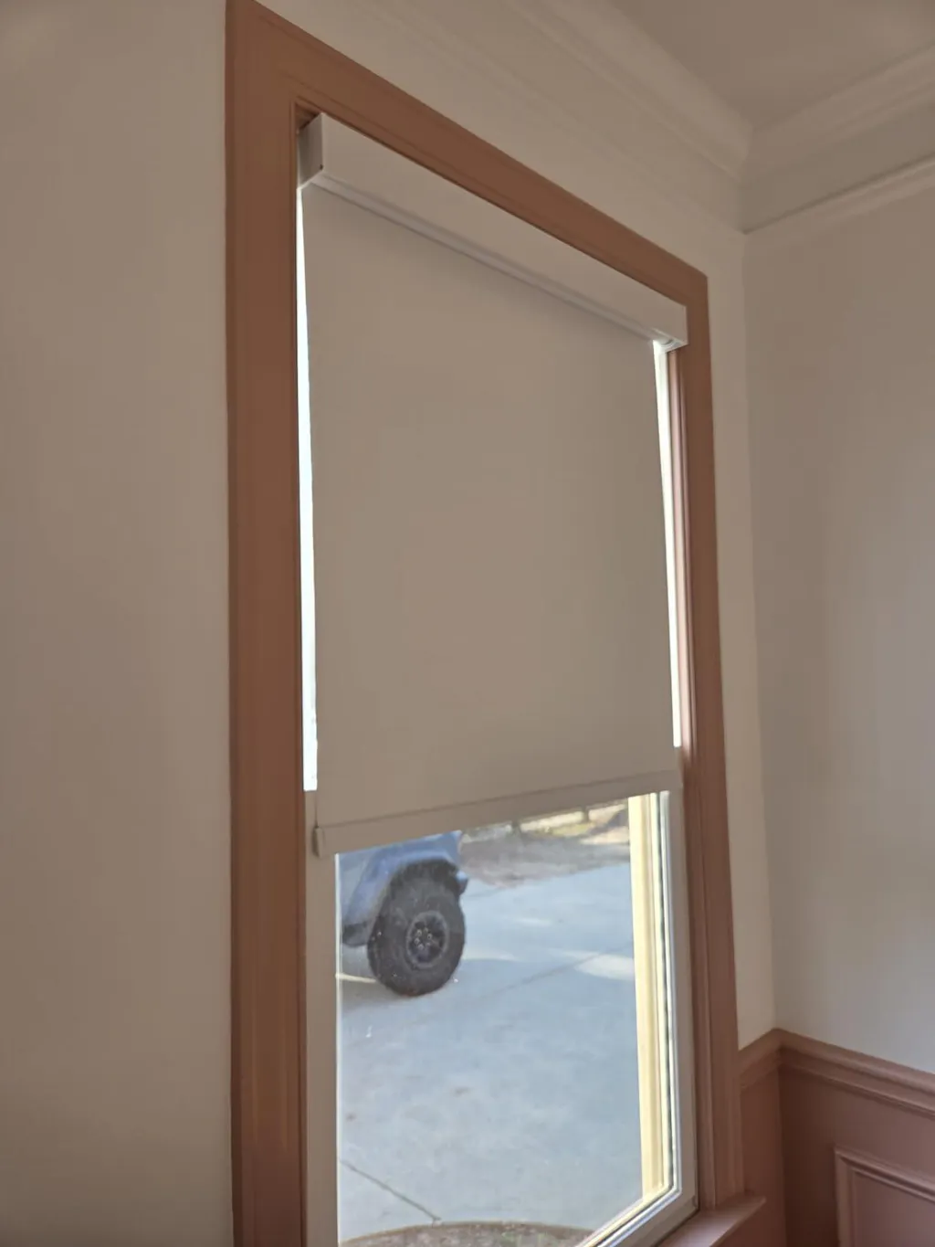
High contrast is not the enemy; misuse is. There are moments when a bold, monochrome treatment is exactly what the room needs. If you are styling a minimalist kitchen with white quartz counters and black cabinetry, a solid black roller shade can act as a grounding anchor. It defines the window as a structural element rather than just a hole in the wall. The sleek profile of roller shades works here because it stays tight to the glass, maintaining the architectural integrity of the frame.
Bathrooms are another win for this look. A crisp white bathroom with matte black fixtures is the perfect canvas for a high-contrast shade. It adds a punch of 'graphic' energy that prevents the space from looking like a sterile hospital wing. The key is to avoid the stripes. Stick to a solid black shade in a white frame, or a white shade with a black border. This frames the view like a piece of art, especially if you have a garden or a skyline worth looking at.
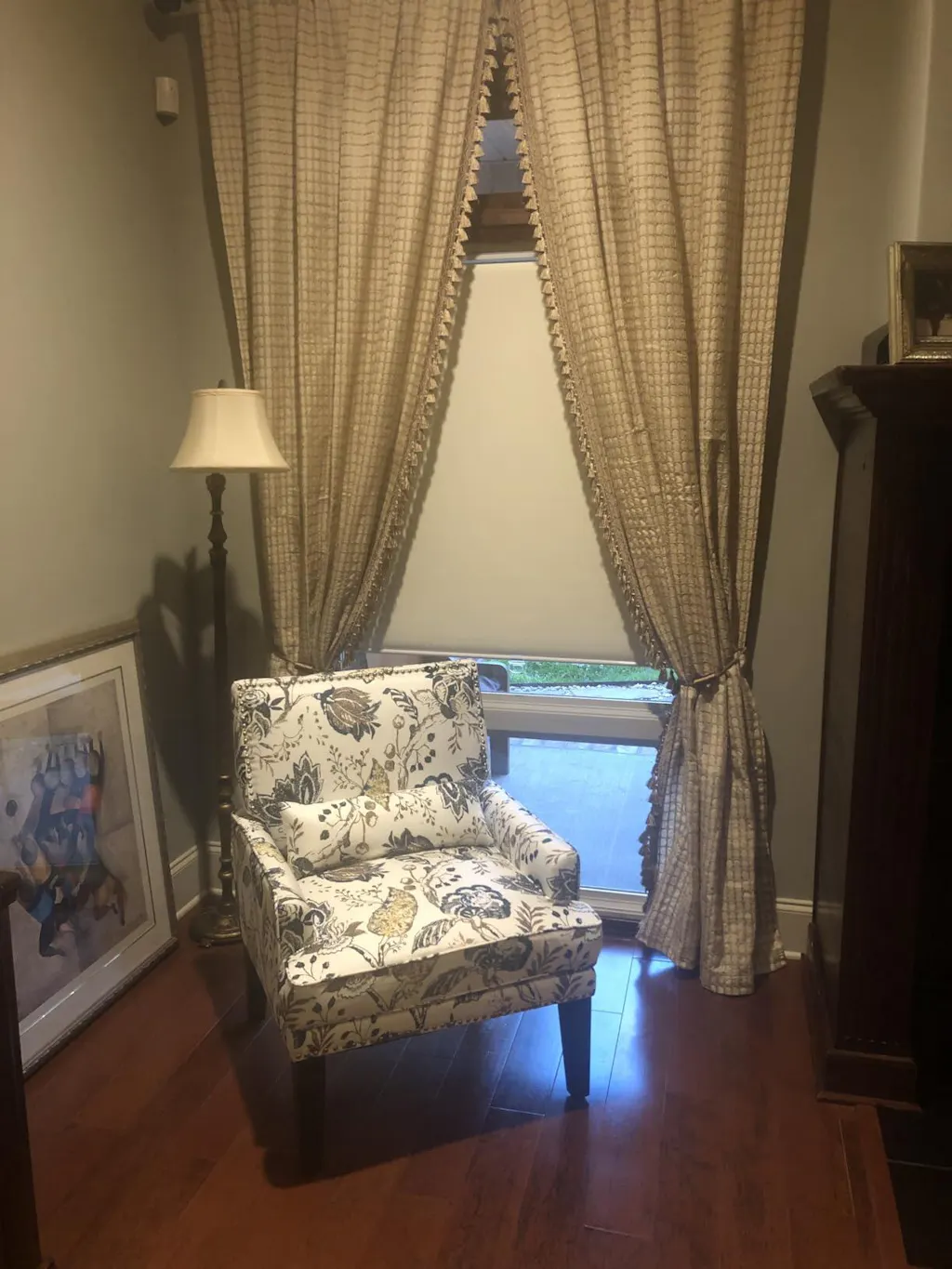
Layering is the Secret to Softening High Contrast
If you have fallen in love with the idea of black blinds but fear the starkness, layering is your best friend. I always recommend pairing a black roller or Roman shade with a sheer white linen drape. Go for a 150 to 180 gsm linen with a 2.5x fullness. When the black shade is down, the white sheer softens the edges and stops the black from feeling like a 'black hole' in the wall. It adds a layer of depth that a single treatment just cannot achieve.
Another way to bridge the gap is by using dual-functionality. I often suggest systems where day night shades transition smoothly between opaque black and sheer white. This allows you to control the 'vibration.' By adjusting the overlap, you can create a soft, filtered light that feels intentional. It is about having the ability to dial the contrast up or down depending on the time of day and the mood you want to set.
Black Mesh vs. White Fabric: A Crucial Distinction
One of the most common mistakes I see is people choosing white mesh shades for a view-heavy room. It is counterintuitive, but white mesh reflects light back into your eyes, creating a 'fog' effect that obscures the outside world. If you want to see your garden, you need black mesh. Black mesh absorbs light, allowing your eyes to focus through the holes to the greenery beyond. This is why black mesh reads better for anyone prioritizing a view.
White fabric, on the other hand, is your privacy hero. A white solar shade or fabric roller acts like a giant softbox in a photography studio. It catches the sun and bounces it around the room, making everything feel bright and airy while completely blocking the neighbors' view. If you are styling a bedroom, white fabric is the way to go. If you are styling a sunroom where the view is the main event, go black. Just make sure the material has a 3% to 5% openness factor so you do not lose the breeze.
My Go-To Hardware Finishes for Two-Tone Windows
Hardware is where a monochrome look usually falls apart. People get nervous and try to introduce a third 'neutral' like brushed nickel or brass. Don't do it. If you have black and white blinds, your hardware should be either matte black or crisp white. Mixing in a third metal creates a visual 'clutter' that detracts from the clean, graphic lines you are trying to achieve.
For a truly seamless look, I recommend a motorized dual roller shades system. This allows you to house both a black blackout shade and a white solar shade in a single, matte-finished cassette. It eliminates the mess of multiple chains and cords, which is essential when you are working with high-contrast colors. Any extra 'noise' like dangling plastic chains will immediately make the windows look cheap. Keep it motorized, keep it cordless, and keep the hardware matching the darker tone of the room's accents.
The Final Rule: Let the Window Be the Star
When you commit to a high-contrast window treatment, you are making a statement. You have to let that statement breathe. That means the rest of your window styling—the sills, the nearby art, the furniture placement—needs to stay quiet. Do not crowd a black-and-white window with colorful knick-knacks or busy wallpaper. Let the window be the star of the wall.
I once spent three hours helping a friend re-style her living room because she had gorgeous black Roman shades but had placed a bright red velvet chair right in front of them. The colors fought for dominance until we swapped the chair for a neutral charcoal one. Suddenly, the windows looked like a deliberate design choice rather than an accident. Design is as much about what you take away as what you put in.
My Personal Design Fail
I once tried to save money by buying 'off-the-shelf' black rollers for a sunroom project. I didn't account for the 1/4-inch light gap on the sides that comes with standard sizes. Every morning, a literal laser beam of light would cut through the gap and hit me right in the eye while I drank my coffee. I eventually tried to fix it with electrical tape (don't ask), which looked horrific. I ended up having to mount them outside the frame with a custom valance to hide the gap. The lesson? High-contrast treatments show every flaw. Measure twice, or just go custom from the start.
FAQ
Do black blinds make a room feel smaller?
Not necessarily. If you use a black mesh or a shade with some translucency, it can actually make the walls feel like they are receding, which can open up a space. However, a solid black blackout shade in a small room can feel heavy if it is not balanced with light-colored furniture and plenty of lamps.
Can I mix black blinds with white walls?
Yes, it is a classic look. To keep it from feeling too cold, bring in some natural wood tones or a jute rug. The organic texture of the wood balances the 'industrial' feel of the black and white contrast.
Are motorized shades worth the extra cost?
For dual systems (black and white together), absolutely. Having two sets of manual chains is a tangled nightmare. Motorization keeps the look clean and allows you to adjust both layers with one remote, which is a life-saver for tall or hard-to-reach windows.