The 4 Window Shade Designs That Make Basic Rooms Look Expensive
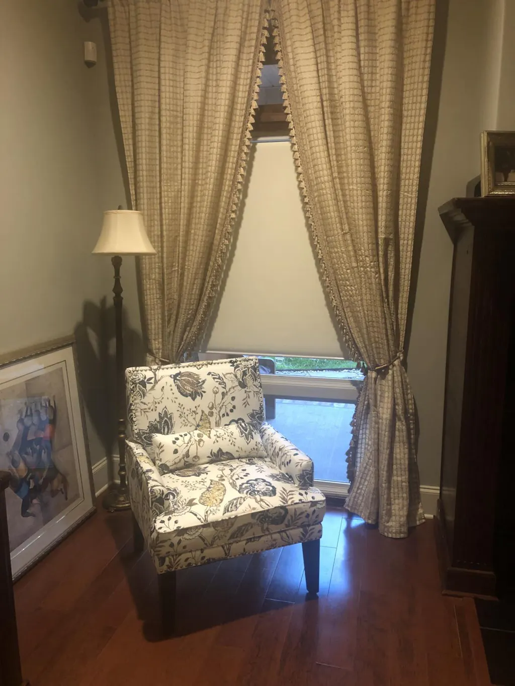
I remember staring at my first 'grown-up' apartment—a boxy rental with eggshell walls and those tragic plastic mini-blinds that always seemed to hang at a five-degree tilt. It felt like a doctor's waiting room. I spent three months agonizing over paint chips before realizing the problem wasn't the walls; it was the windows. The second I swapped those plastic slats for a heavy, block-printed Roman shade, the room finally had a pulse.
Choosing window shade designs isn't just about blocking the sun; it's about deciding whether your windows are background noise or the lead singer. Most people play it too safe. They buy 'greige' because they're afraid of commitment, but a bold pattern is often the only thing standing between a room that looks finished and one that looks like a staging unit.
Quick Takeaways
- Scale matters more than the print itself; small windows need tight motifs, while large windows need room to breathe.
- Natural wovens provide texture that mimics a pattern without the visual noise of a high-contrast print.
- Treat architectural oddities like arches as features using specialized treatments rather than hiding them.
- Layering a patterned shade under a neutral drape adds depth and high-end hotel vibes.
I Used to Default to Plain White—Here is Why I Stopped
For years, I told clients that white was 'timeless.' In reality, it was a crutch. Plain white treatments often act as a giant light-box that flattens every other texture in the room. When you walk into a space that feels expensive, it's usually because there's a layering of visual weight that white polyester simply can't provide.
A window shouldn't be a void. Introducing a pattern or a structured design creates a frame for the view outside. I’ve seen too many gorgeous renovations fall flat at the finish line because the owners thought they could coast on basic linen. Are Your Window Shades Interior Designs Biggest Afterthought? If you're staring at a 'finished' room that still feels cold or clinical, the answer is probably yes.
The Golden Scale Rule for Window Shades With Designs on Them
The biggest mistake I see with window shades with designs on them is a mismatch in scale. If you put a tiny, ditsy floral on a massive 72-inch wide picture window, it looks like visual static from a distance. Conversely, a massive 12-inch ikat repeat on a tiny bathroom window will get chopped off in all the wrong places, losing the integrity of the design.
Here is my rule of thumb: for small windows (under 30 inches wide), keep your pattern repeat under 4 inches. This ensures you actually see the design intent. For those sprawling floor-to-ceiling situations, go big. A large-scale botanical or a wide horizontal stripe gives the eye a place to rest. I always look for a 15-inch repeat or larger for 'statement' windows to keep the look sophisticated rather than frantic.
Designer Shades for Windows: Wovens vs. Custom Prints
When shopping for designer shades for windows, you’re usually choosing between two camps: the organic texture of a woven wood or the crisp precision of a fabric print. Wovens—think bamboo, grasses, or jute—are the 'quiet luxury' of window treatments. They offer a rhythmic design through material alone, which is perfect if you’re color-averse but hate boring rooms.
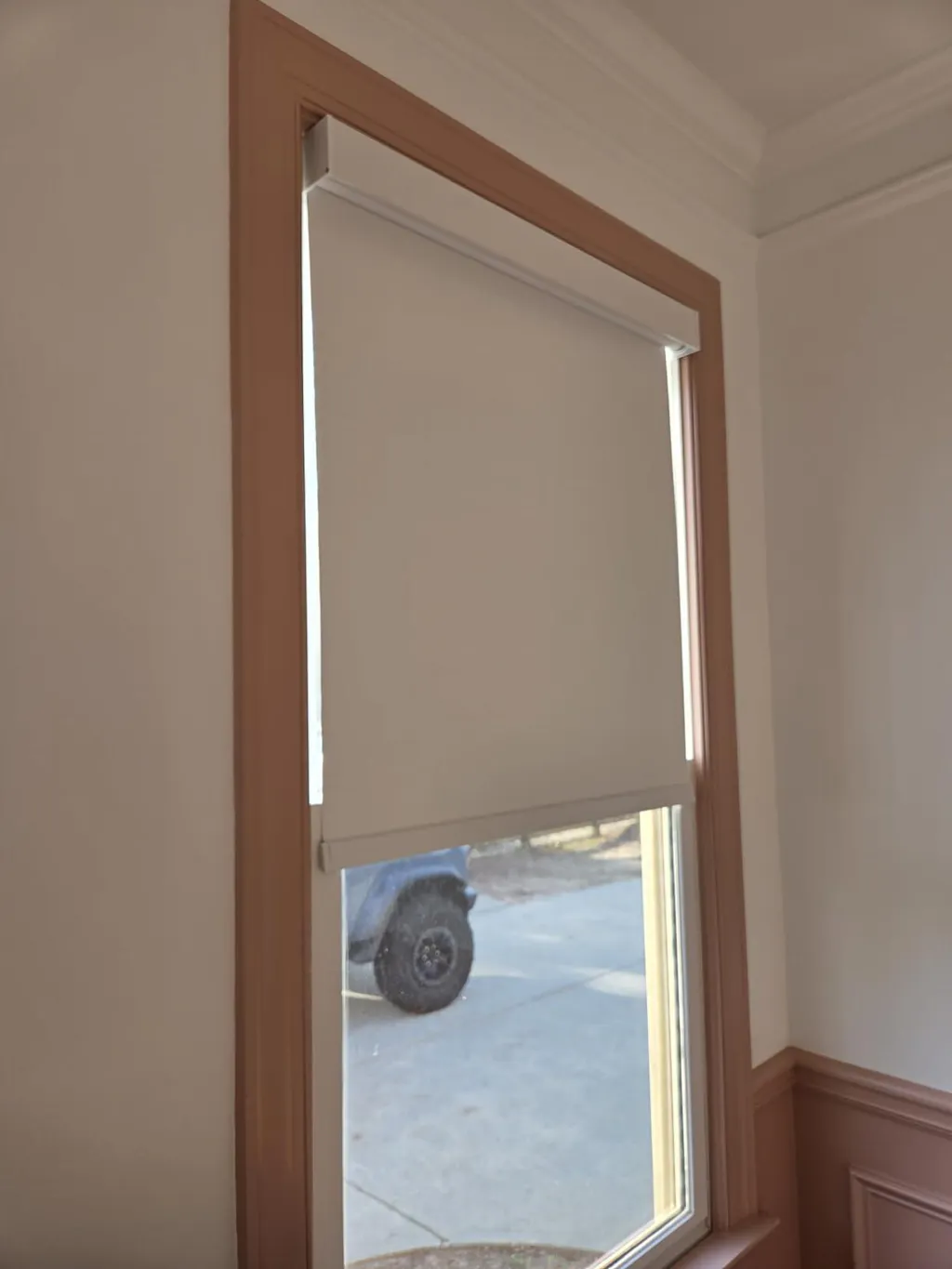
On the other side, you have custom fabric prints. If you want a specific Chinoiserie or a sharp geometric, Roller Shades provide the ultimate flat canvas. Unlike Roman shades, which have folds that can hide parts of a complex pattern, a roller shade displays the fabric like a piece of art. I love using a 300 gsm cotton-polyester blend here; it’s heavy enough to hang perfectly straight without curling at the edges, which is the hallmark of a cheap, thin shade.
Tackling Quirky Architecture: Arches and Spider Blinds
We’ve all seen them: the arched windows that look great from the curb but are a nightmare to style. Many people give up and leave them bare, or worse, use a tension rod that cuts the arch in half. Don't do that. Specialized window shades with designs like sunburst arches or spider blinds—those clever fan-like treatments—are meant to celebrate the curve.
If you have a 'spider' or fan-style window, lean into the geometry. A pleated fabric in a soft charcoal or a deep navy creates a striking architectural focal point. It’s better to have one perfectly fitted, high-quality shade than a generic curtain that hides the very thing that makes your house unique. These window shades with designs transform a 'problem window' into a deliberate design choice.
How to Layer Window Shades With Designs Without Creating Chaos
The secret to that bespoke look isn't just one shade; it's the stack. I love pairing a patterned Roman shade with a solid, floor-length drape. The key is to pull one secondary color from the shade's pattern—not the dominant background color—and use that for the drapes. This creates a cohesive thread without looking like a matching bed-in-a-bag set.
For maximum utility, I often spec Day Night Shades. You can have your decorative, patterned layer facing the room for style, backed by a functional blackout or privacy layer. This prevents the 'chaos' of having too many competing fabrics. If your shade has a busy motif, keep your hardware matte and minimal. A chunky, ornate rod on top of a busy print is how rooms start looking like a Victorian tea room gone wrong.
The Exact Rooms Where I Always Spec Patterned Treatments
Powder rooms are my playground. Since people only spend a few minutes there, you can go wild with a high-contrast pattern without it becoming exhausting. I also love a patterned shade in a dining room. It adds a layer of softness that balances out the hard surfaces of a dining table and wooden chairs.
Lastly, minimalist bedrooms need the 'soul' that a patterned shade provides. If your bedding is all white and your walls are pale, a soft watercolor-print shade in a linen-viscose blend provides that organic, lived-in feel. It breaks up the monotony and makes the room feel curated rather than just furnished.
My Biggest Styling Regret
I once tried to save money on a guest room by DIY-ing a 'no-sew' Roman shade using a heavy upholstery velvet I found on clearance. It looked incredible for exactly three days. Then, the weight of the velvet caused the adhesive to fail, and the whole thing slumped like a sad accordion in the middle of a July heatwave. I learned the hard way that when it comes to patterned treatments, the structure matters as much as the print. Now, I always insist on professional-grade headers and proper cord systems. It’s cheaper than replacing a 'budget' fail twice.
FAQ
Will patterned shades make my small room look smaller?
Actually, the opposite is often true. A vertical pattern can draw the eye up, making ceilings feel higher. Just avoid dark, heavy fabrics in tiny spaces; stick to light backgrounds with crisp, clean motifs.
How do I clean shades with intricate designs?
Most designer fabrics prefer a light vacuuming with a brush attachment once a month. If you have a spill, blot—never rub—or you’ll distort the print and leave a permanent 'halo' on the fabric.
Are patterned shades a trend that will go out of style?
Classic motifs like stripes, herringbones, and subtle botanicals have been around for centuries. Avoid 'neon' or overly trendy colors and stick to a palette that complements your home’s existing architecture for longevity.