I Refuse to Use Plain White Rollers: How I Design Window Shades Now
I remember staring at the four windows in my first serious apartment. They were covered in those brittle, yellowing vinyl rollers that snapped back like a mousetrap if you looked at them wrong. It felt like living in a staging area, not a home. The morning sun didn't glow; it just punched through the gaps, highlighting every dust mote on the floorboards. That was the year I decided to actually design window shades that meant something to the room's architecture.
The shift happened when I swapped a cheap plastic pull-down for a heavy-weight, 350 gsm flax linen Roman shade. Suddenly, the light didn't just enter the room—it was curated. The fabric had a slight slub that caught the late afternoon sun, turning a cold white box into a space that felt intentionally lived-in. Since then, I’ve been on a mission to kill the 'landlord special' aesthetic one window at a time.
Quick Takeaways
- Texture beats color every time for adding depth without visual clutter.
- Always test your fabric against the glass at high noon and 5 PM.
- Mounting high and wide (at least 4-6 inches outside the frame) creates the illusion of larger windows.
- Hardware should match your lighting fixtures or door hardware for a cohesive feel.
Why I Stopped Treating Window Coverings as Invisible Necessities
For too long, the industry told us that window treatments should disappear. We were sold on the idea that white-on-white was the only way to keep a room 'airy.' But 'airy' often ends up looking unfinished and hollow. When you default to standard roller shades in basic vinyl, you’re missing out on a massive vertical canvas that can ground your entire furniture arrangement.
Think of your window as a piece of art. If you leave it blank, the eye just slides right past it to the wall. By introducing a soft weave or a subtle herringbone, you create a soft landing spot for the eye. I’ve found that even in the most minimalist rooms, a charcoal grey or a deep oatmeal shade provides the necessary contrast to make white walls actually look crisp rather than dingy.
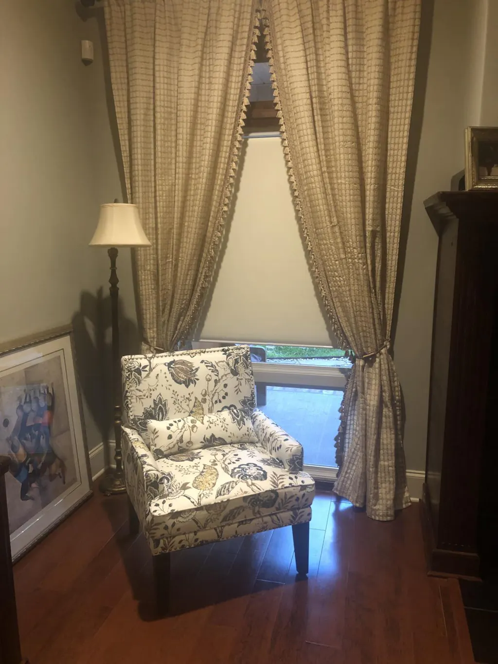
How to Pick a Window Shade With Design That Won't Look Chaotic
The fear of pattern is real. I get it. Nobody wants their living room to look like a 1970s motel. The trick to a successful window shade with design is scale. If your rug has a large, sweeping floral pattern, your shades should be a tight, geometric micro-print or a solid with heavy texture. You want them to talk to each other, not scream over one another.
I recently styled a den with a navy velvet sofa and went with a botanical print shade in muted sage and cream. To keep it from feeling too busy, I used a tailored top treatment. If you're worried about the transition, a modern window shade with valance can actually hide the roll and provide a clean, architectural line that frames the pattern beautifully. It’s about containment—the pattern stays within the frame, acting as a focal point rather than an overwhelming force.
The Backlight Test: What Happens When the Sun Hits Your Pattern
This is where most DIY designers fail. A fabric swatch looks one way on your kitchen table and completely different when it’s backlit by 2,000 lumens of direct sunlight. A beautiful navy print can suddenly look like a muddy silhouette if the fabric isn't opaque enough. Always hold your samples up to the actual window before hitting 'order.'
If you're dealing with a south-facing room that gets brutal heat, you might be tempted by high-performance pull down tinted window shades. These are great for glare, but if you want that cozy interior feel, I suggest a 'sandwich' approach: a decorative fabric shade on the front with a high-quality blackout or thermal liner on the back. This preserves the color of your design while blocking the UV rays that would otherwise wash out your hard work.
Layering Textures: When One Shade Isn't Enough
I’m a huge fan of the 'double-up.' Sometimes you want the privacy of a sheer during the day but the total darkness of a blackout at night. In the past, this meant bulky double rods and four layers of fabric that looked like a stage curtain. Now, I prefer specifying day night shades. It’s a single system that houses two different fabrics—usually a light-filtering weave and a solid privacy layer.
This setup allows you to play with window shading design without the bulk. I recently used a sheer bronze mesh paired with a chocolate blackout liner in a primary bedroom. During the day, the bronze mesh gave the room a warm, filtered glow that looked like a permanent sunset. At night, the blackout layer dropped down for total privacy. It’s functional, but it looks like a custom boutique hotel installation.
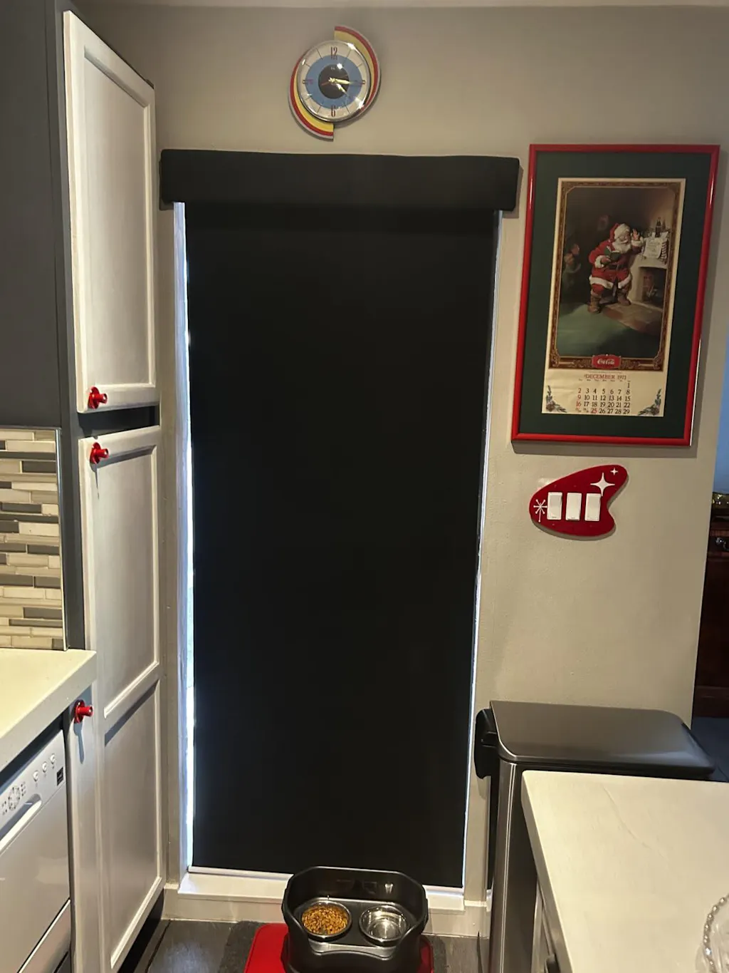
Don't Forget the Exterior: Connecting Indoor and Outdoor Aesthetics
Your house has two 'faces.' I’ve seen beautiful interiors ruined by the 'patchwork quilt' effect from the street—where every window has a different colored shade visible from the outside. When I design window shades, I always ensure the street-facing side is a uniform neutral, usually white or ivory. This keeps the curb appeal consistent even if the inside of your kid's room is bright teal.
If you have a large glass slider leading to a patio, consider how your interior shades coordinate with your outdoor shades 5 openness levels. Using a similar color palette or weave density between your indoor Romans and your outdoor solar shades creates a seamless flow. It makes your living room feel like it extends right into the backyard, which is the ultimate goal for any small-space dweller.
My Biggest Window Fail
I once fell in love with a heavy, 400 gsm velvet for a massive 72-inch wide Roman shade. I was so focused on the 'luxe' feel that I ignored the weight. I mounted it into the drywall with standard anchors, and at 2 AM on a Tuesday, the whole thing came crashing down, taking a chunk of the ceiling with it. Lesson learned: always find the studs, or use heavy-duty toggle bolts for anything over 10 pounds. And for the love of all things holy, measure twice. I once had a three-week delay because I forgot to account for the 'inside mount' clearance, and the shade sat half-in, half-out of the frame like a crooked tooth.
FAQ
Should shades match the wall color?
They don't have to, but they should share an undertone. If your walls are a cool 'Stonington Gray,' don't put up a warm, yellow-based cream shade. It will make the shades look dirty. Aim for a few shades darker or lighter than the wall for a sophisticated, tonal look.
Can I mix patterns on different windows in the same room?
Yes, if the color palette is identical. You can do a stripe on a small window and a floral on a large one as long as they both feature the same navy and cream tones. It makes the room feel curated over time rather than bought in a single box.
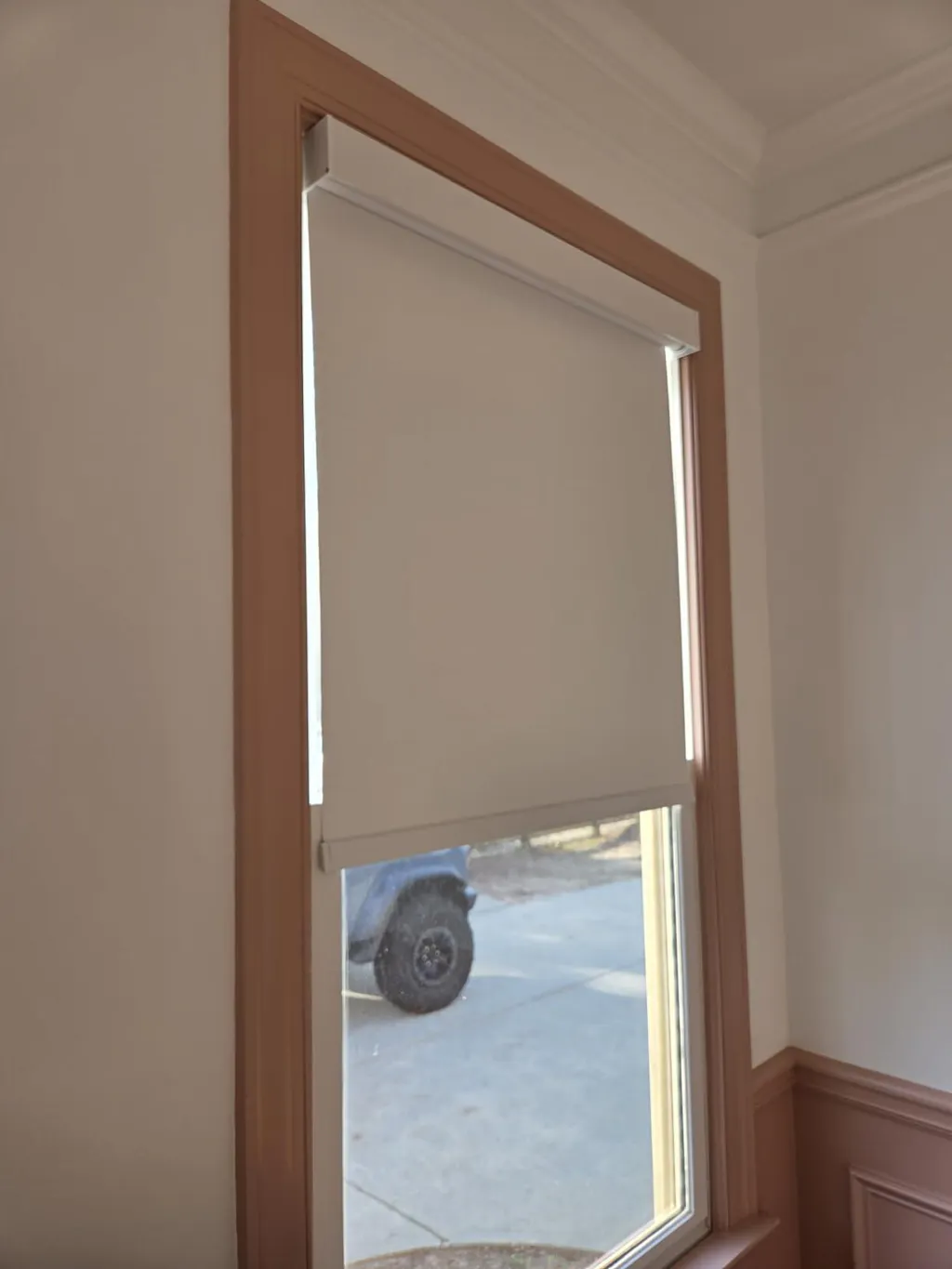
What is the best height to mount a shade?
If you have the space, mount the shade 4 to 6 inches above the window trim. This draws the eye up and makes your ceilings feel significantly higher. Just make sure your shade is long enough to still cover the bottom sill when fully extended.