Are Pictures on Roller Blinds Always Tacky? (My Honest Take)
I remember staring at a blank, stark-white roller shade in my first studio apartment. It felt like a hospital room, cold and utterly devoid of life. I actually considered taking a Sharpie to the fabric just to break up the monotony. That is the exact impulse behind pictures on roller blinds—the desire to turn a functional utility into something with a bit of soul. But there is a very thin line between a bespoke design statement and a window treatment that looks like a cheap souvenir from a boardwalk shop.
- Avoid literal photography; stylized illustrations or vintage maps age much better.
- Resolution is king—never print anything under 300 DPI at full scale.
- Hardware is the 'frame' for your art; never leave the roll exposed.
- Layering with solid drapes prevents the graphic from feeling 'stiff' or isolated.
The Fine Line Between Bespoke Art and a Novelty Gimmick
Most people cringe at the mention of printed shades because they immediately picture a grainy, low-resolution photo of a city skyline or a family portrait stretched across five feet of vinyl. It is a tragedy of execution, not the concept itself. When you move away from the standard solid colors found in most roller shades and treat the fabric like a blank canvas, you can actually solve architectural problems.
A well-chosen graphic can act as a faux view in a room that looks out onto a brick wall. The trick is to treat the shade as large-scale art or custom wallpaper rather than a novelty. I have seen 72-inch windows transformed by a single, oversized charcoal sketch that made the room feel like a high-end gallery rather than a suburban bedroom. It is about the intent behind the image.
What Actually Works as Picture Roller Blinds
Realism is usually the enemy when it comes to picture roller blinds. A high-def photo of a tropical beach rarely works because the scale is usually 'off' and the lighting never matches your actual room. Instead, look toward stylization. Vintage botanical illustrations, antique nautical maps, or even a moody, oversized chinoiserie toile can be breathtaking.
Think about the substrate, too. A 250 gsm polyester-linen blend has a slight tooth to it that catches the light and gives the ink a matte, sophisticated finish. If the fabric is too shiny, the image looks like a plastic banner. I am currently obsessed with abstract watercolor washes—huge, bleeding edges of indigo and grey that look like a custom mural when the shades are drawn but disappear into a neat roll when they are up.
The Resolution Rules for Roller Blinds With Images
Let's talk about the technical heartbreak of the 'pixelated mess.' A photo that looks crisp on your iPhone screen will look like a Lego set when blown up to 60 inches wide. If you are sourcing your own imagery, the file needs to be massive. I generally tell people to look for vector files or high-resolution scans of physical art.
The weave of the fabric also plays a role in image clarity. A tight, smooth blackout fabric will hold sharp lines better than a loose, textured light-filtering weave. If you want a crisp, detailed map, go with a smooth finish. If you want a soft, painterly landscape, a bit of fabric texture can actually help hide slight imperfections in the image file and make it feel more like a textile and less like a print-out.
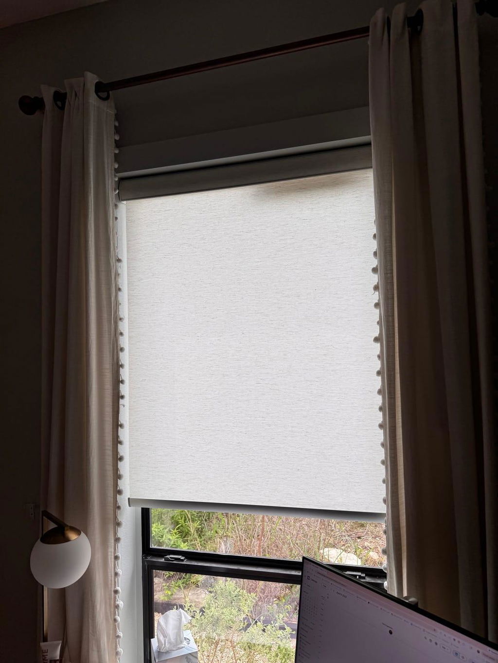
Framing the 'Art': Why the Hardware Matters More Now
If you are treating your window treatment like a piece of art, you cannot ignore the frame. Leaving the raw fabric roll exposed at the top of the window ruins the illusion immediately. It looks like a DIY project gone wrong. To make the graphic feel intentional, you need a structural top treatment.
I found that my roller blinds with valance setup was the only way to make a printed shade look high-end. A sleek aluminum cassette or a fabric-wrapped valance acts as the frame, hiding the mechanics and the white underside of the fabric. When the shade is lowered, the image appears to drop seamlessly from the ceiling, which is a much more polished look than seeing the 'guts' of the roller mechanism.
The 3 Rooms Where Printed Shades Actually Belong
Powder rooms are the ultimate playground for this. They are small, contained, and frankly, a bit boring. A bold, maximalist botanical print on a roller shade can replace the need for expensive wallpaper. Kids' rooms are another win, provided you skip the cartoon characters. Think sophisticated, hand-drawn stars or a vintage-style map of the moon—something they won't outgrow in eighteen months.
Finally, consider those awkward spots where you have zero wall space for art. I once solved the 'fishbowl' feeling of a kitchen back door by using roller blinds on door glass featuring a subtle, etched-glass pattern. It provided privacy and visual interest without cluttering a high-traffic area. It turned a boring exit into a design feature.
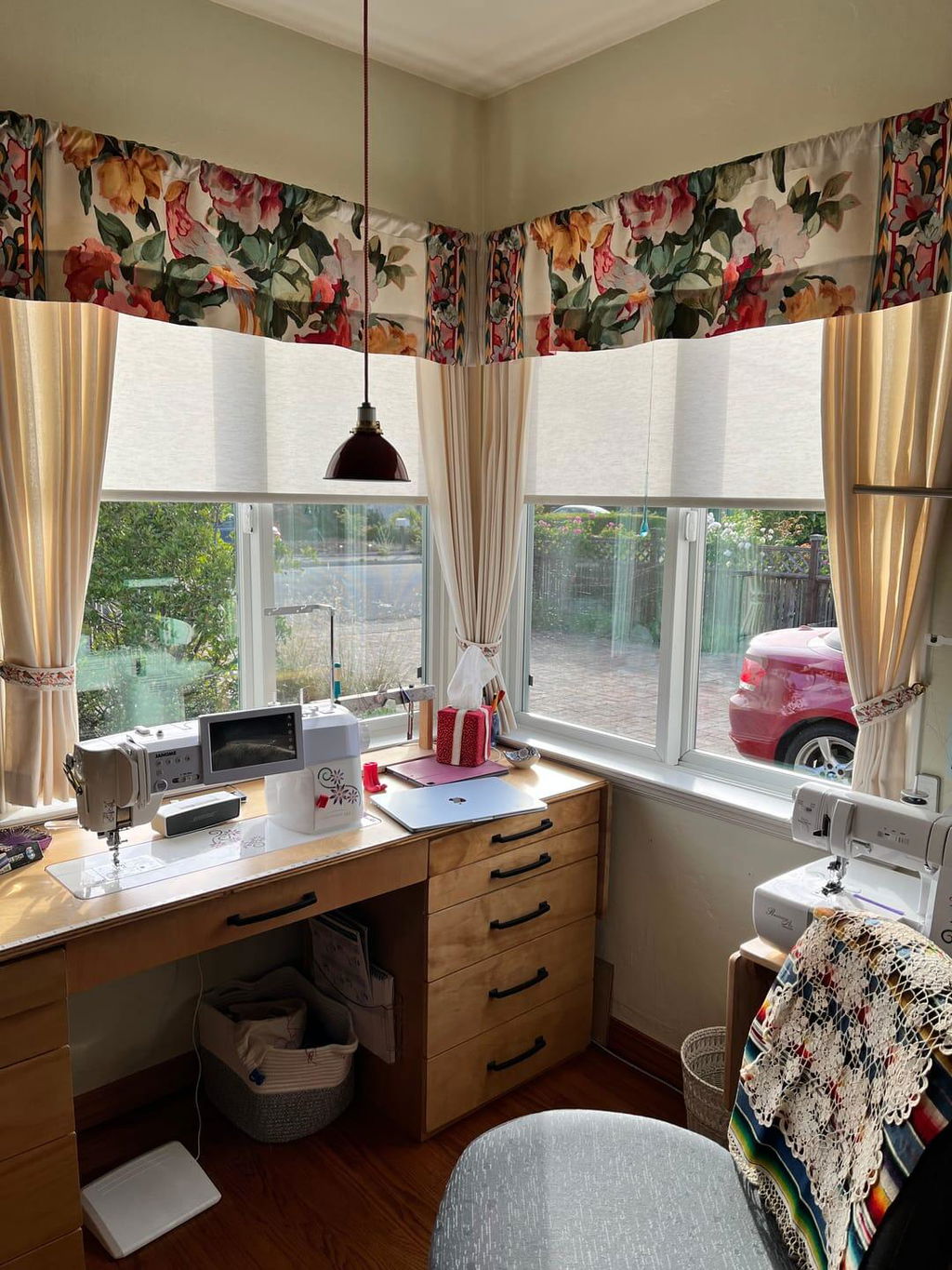
Layering: Don't Let the Graphic Stand Alone
The biggest mistake people make with printed shades is letting them stand entirely on their own. A flat, graphic shade can look a bit 'thin' if it isn't grounded. I always suggest flanking the window with a pair of solid, textured drapery panels. This softens the hard edges of the roller shade and frames the artwork, making it feel like part of a cohesive window design.
If you are worried about the functionality of a single printed layer, look into dual roller shades. This allows you to have your decorative, printed shade on the front layer and a functional, heavy-duty blackout shade behind it. You get the 'art' during the day when the light filters through, and total privacy at night without sacrificing the aesthetic.
Can I use a photo I took on my phone?
I wouldn't recommend it. Most phone photos don't have the file size required for a 48-inch or 60-inch print. You will likely end up with blurry edges and 'noise' in the shadows. Stick to professional stock photography or high-res art scans.
Do printed blinds fade in the sun?
Modern UV-resistant inks are quite hardy, but constant direct southern sun will eventually cause some fading over several years. If the window gets intense heat, choosing a high-quality 'solvent-free' sublimation print is your best bet for longevity.
How do I clean a printed roller shade?
Skip the harsh chemicals. A dry microfiber cloth or a very slightly damp sponge is all you need. You don't want to scrub the ink or saturate the fabric, as this can distort the image or cause water spots on the print.