Are Pattern Window Shades the Secret to Curing a Boring Room?
I remember standing in my first 'grown-up' apartment, staring at a sea of rental-beige walls and gray laminate flooring. It felt like living inside a dry, flavorless mushroom. I had the mid-century sofa and the jute rug, but the room was flat. It lacked a pulse. Then I swapped the cheap plastic blinds for pattern window shades in a moody, oversized botanical print, and suddenly, the room had architecture. It didn't need more furniture; it just needed a point of view.
The Quick Takeaways
- Scale is king: Large windows need large repeats; small windows need tight motifs.
- Mix, don't match: Pair your patterned shades with a different scale rug (geometric vs. organic).
- Fabric weight matters: Choose a 250-300 gsm linen or cotton blend for a crisp, high-end drape.
- Street view: Always use a white or ivory liner to avoid a 'house is blushing' look from the curb.
Why We Stopped Using Prints at the Window (And Why I'm Bringing Them Back)
For the last decade, we have been collectively terrified of color. We fell into a 'drywall box' trap where every window treatment had to be white, off-white, or 'greige' to ensure resale value. The result? Rooms that feel like high-end hotel lobbies—clean, sure, but totally devoid of soul. When you use patterned window shades, you aren't just covering glass; you are hanging art that moves.
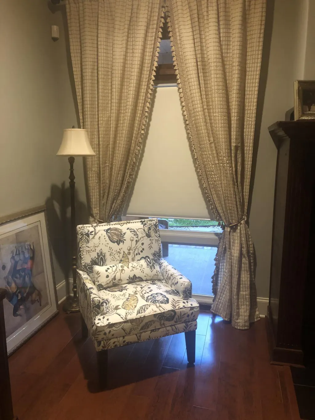
The beauty of a shade is that it occupies a vertical plane. It breaks up the monotony of painted walls without eating into your floor space like a bulky cabinet or a gallery wall would. By introducing patterned shades, you inject a narrative. Are you English Countryside? Mid-century Modern? Dark Academia? The window tells the story before you even sit down.
The Golden Rule of Scale for Pattern Shades for Windows
The most common mistake I see is a scale mismatch. If you have a massive picture window and you choose a tiny, ditsy floral, the pattern will vanish into a muddy blur from ten feet away. Conversely, if you put a massive 24-inch ikat repeat on a narrow 18-inch bathroom window, you might end up with one awkward, off-center blob of color. It looks like a mistake, not a design choice.
For large windows, go big. Think sweeping vines, large-scale geometrics, or abstract washes of color. Because they sit flush and tight, flat roller shades act like a gallery wall for your windows, providing a smooth surface that doesn't distort the motif. For smaller windows, keep the pattern repeat under 6 inches to ensure the eye can actually 'read' the design. These pattern shades for windows should enhance the architecture, not fight it.
How to Mix Patterned Window Shades With Your Current Rugs
People often panic when they have a patterned rug and want to add patterned window shades. The trick is the 60/30/10 rule and varying your 'shapes.' If your rug is a busy, geometric Persian or a striped kilim, don't use another geometric on the window. Instead, go for something organic—a soft floral or a watercolor wash. This creates a visual break.
Match the 'vibe' but vary the scale. If the rug has a small, intricate pattern, make the window shade pattern significantly larger. Ensure there is at least one common color thread—a specific shade of navy or a muted sage—that appears in both. This creates a cohesive look that feels curated by a pro, not a random collection of items you found on sale.
Fabric Matters: Why Stiff Materials Ruin a Good Print
I have a strong opinion on vinyl: keep it in the garage. When you print a beautiful pattern on a stiff, plastic-feeling material, it catches the light in all the wrong ways and looks incredibly cheap. It doesn't matter how pretty the floral is if the material reminds you of a hospital privacy curtain. The texture of the fabric is what gives a print its depth.
If you want that high-end, bespoke look, switching from stiff, shiny vinyl to fabric pull down window shades is the only way to ensure the print looks like textile art. Look for cotton-linen blends with a visible weave. The way the light filters through the threads softens the pattern and makes the colors feel 'baked in' rather than just stamped on the surface. A 280 gsm weight is the sweet spot—heavy enough to hang straight, but light enough to operate smoothly.
The One Mistake That Makes Patterned Shades Look Awkward
The biggest 'oops' moment is forgetting about the street view. You might love a high-contrast black and white zig-zag in your office, but if that's the only window with a pattern, it looks like a chaotic outlier from the outside of your house. Always ensure your patterned shades are 'duo-tone' or have a neutral liner facing the street. It keeps the exterior of your home looking uniform while allowing you to go wild inside.
Also, be careful with layering. If you are putting drapes over your shades, the drapes should be a solid, textural fabric—think a heavy velvet or a chunky linen. Layering patterned shades under patterned drapes is a recipe for a migraine. While I love a bold print in the living room, I often suggest day night shades for bedrooms where light control is the priority, saving the bold motifs for the common areas where you actually want to see them during the day.
A Lesson Learned at Midnight
Early in my career, I ordered a set of custom Roman shades for a client's breakfast nook. I found this incredible oversized citrus print—lemons the size of softballs. I was so excited I didn't check the horizontal repeat math. When they were installed, the way the fabric folded meant that every time the shades were halfway up, the lemons were sliced perfectly in half. It looked like a fruit massacre. I ended up paying out of pocket to have them remade with a smaller print. The lesson? Always visualize the pattern at every height, not just when the shade is fully closed.
FAQ
Do patterned shades make a room look smaller?
Actually, no. If you choose a pattern with a light background and a large, airy scale, it can actually make the walls feel further away. It's the dark, tight, 'busy' patterns that tend to close a space in.
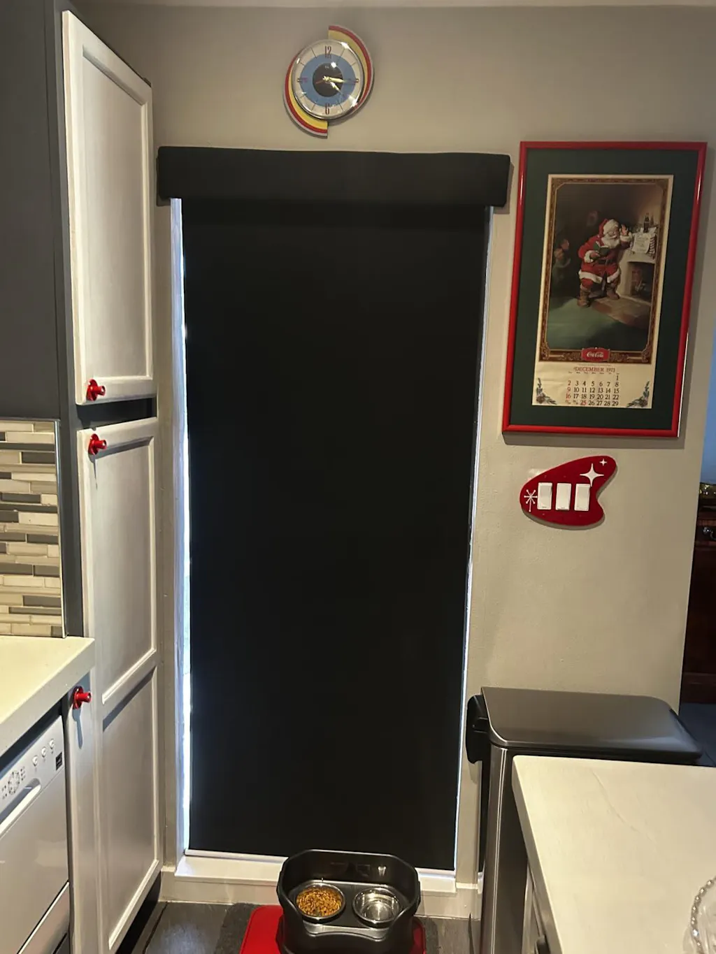
Can I use patterned shades in a kitchen?
Absolutely, but choose a performance fabric. Kitchens are high-splatter zones. Look for a polyester-linen blend that can be spot-cleaned easily without the print bleeding.
How do I choose a color for my pattern?
Look at the third or fourth most prominent color in your room—maybe the color of a throw pillow or a small stripe in your rug. Use that as the primary color for your window pattern to make the room feel intentional.